

Turn feedback into actionable insights
Satisfaction Ratings App
- Web-based front-end application
- Effortless feedback collection
- Enhance customer engagement and trust
- Drive continuous improvement through data-driven strategies
- Identify service gaps and optimize processes
- Advanced evaluation and analytics
Empower your organization with a simple yet powerful way to capture real-time feedback from employees, customers, and partners. Our Satisfaction Ratings App makes it effortless for users to share their experience by allowing them to select a rating in just a few taps. Every response is securely recorded, providing a clear view of satisfaction levels across your services. With comprehensive analytics based on collected data, you can identify trends, uncover opportunities for improvement, and make informed decisions that drive growth and enhance the customer experience.
Advanced Analytics aggregates ratings and qualitative feedback to deliver actionable insights and identify performance trends. Dynamic Reporting provides interactive dashboards and detailed reports for informed decision-making. It is ideal for organizations seeking to monitor and improve customer satisfaction, streamline feedback collection, and strengthen brand loyalty.
Basic Functionality
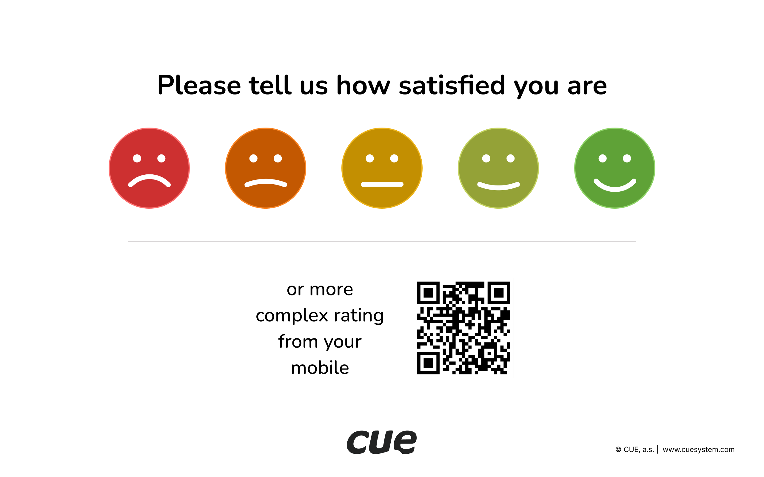
Home screen
- Five rating levels
- QR code for more detail rating on mobile device
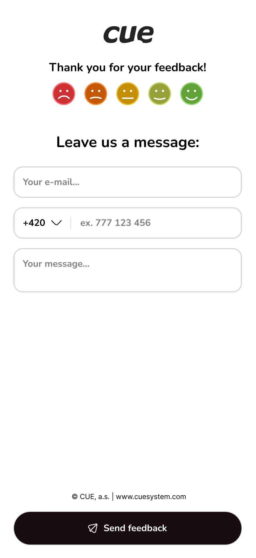
More details on a mobile device
- Not mandatory for rating
- Email, phone number, and message can be entered
Satisfaction Overview & Analytics
Visual insights into satisfaction, trends, and detailed responses
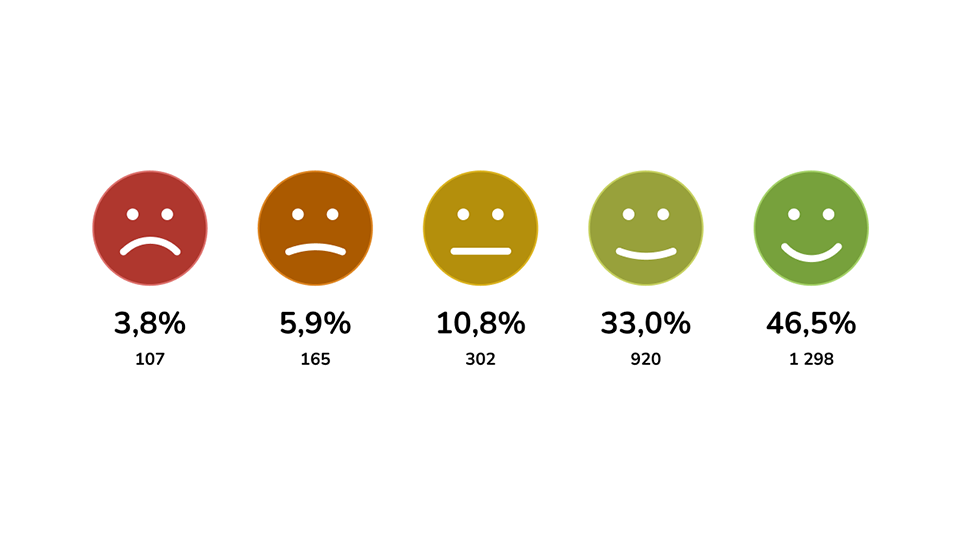
Overall Satisfaction Overview
The chart shows the overall distribution of satisfaction ratings using a set of smiley faces. For every smiley, the chart displays two key metrics: the percentage of total responses and the absolute number of responses. This allows the viewer to quickly understand how many participants selected each satisfaction level and how strongly each category is represented across the entire dataset. The smiley icons visually guide the reader from very negative to very positive feedback, making the chart clear, intuitive, and easy to interpret at a glance.
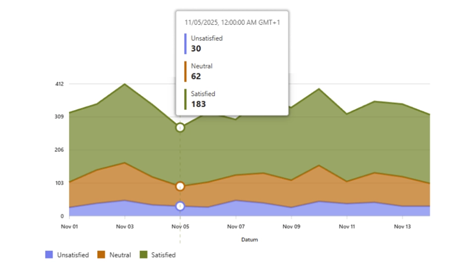
Satisfaction Ratings Over Time
The chart displays how customer satisfaction levels change over time, using three categories: Satisfied, Neutral, and Unsatisfied. Each category is shown as a colored area, indicating the number of responses in each group on a given date. When hovering over a specific day, the chart shows the exact number of responses for each category. This makes it easy to compare daily trends and see how overall satisfaction shifts across the displayed time period.
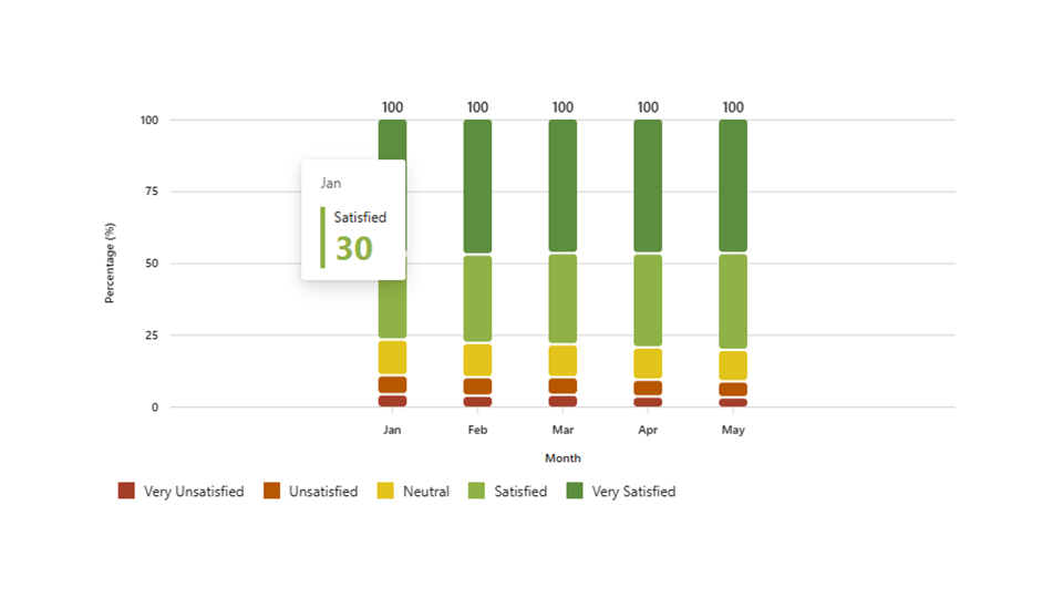
Monthly Satisfaction Rating
This chart presents the monthly distribution of satisfaction levels using a 100% stacked bar format. Each bar represents one month and is divided into five categories: Very Unsatisfied, Unsatisfied, Neutral, Satisfied, and Very Satisfied. The height of each colored segment shows the percentage share of responses in that category. This makes it easy to compare how customer sentiment shifts across months while keeping the total responses normalized to 100%.
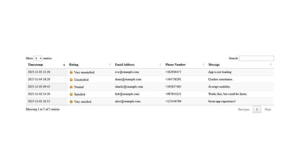
Feedback Details
This table lists individual customer feedback entries, including the response timestamp, selected satisfaction rating, and customer contact information. It also displays each user’s submitted message, providing additional context for their rating. The table helps quickly review detailed feedback and understand specific issues or positive experiences reported by customers.